

Steal 12 Brand Guidelines Examples Built for Design Systems

The best brand guidelines examples right now share one trait: they live on the web, not in a locked PDF nobody opens twice. Netflix, Spotify, and Mastercard all publish searchable brand portals with downloadable logos, color tokens, and real in-use examples designers can copy in minutes. This piece rounds up twelve of them, breaks down what to actually take from each, and provides you with a checklist for turning inspiration into a working brand book.
Table of Contents
What Makes Great Brand Guidelines
A brand guideline earns its keep when someone on your team can open it, find what they need, and use it correctly without emailing three people to confirm. That is the entire test. Everything else, the mood boards, the brand story, the aspirational language, is decoration on top of that core function.Frontify’s roundup of favorite guidelines makes a case that keeps proving true across the industry: the shift is away from policing documents and toward enabling resources. Nobody wants a 90-page manifesto. They want the logo file, the hex code, and a clear answer to “can I stretch this?”
Here is the lens to judge any example against, including the twelve below:
- A searchable, accessible web hub. Static PDFs get outdated the moment a color shifts. A portal can be updated in an afternoon.
- Actionable rules, not vague sentiment. “Bold and modern” tells a designer nothing. “Minimum logo clear space equals the height of the wordmark” tells them everything.
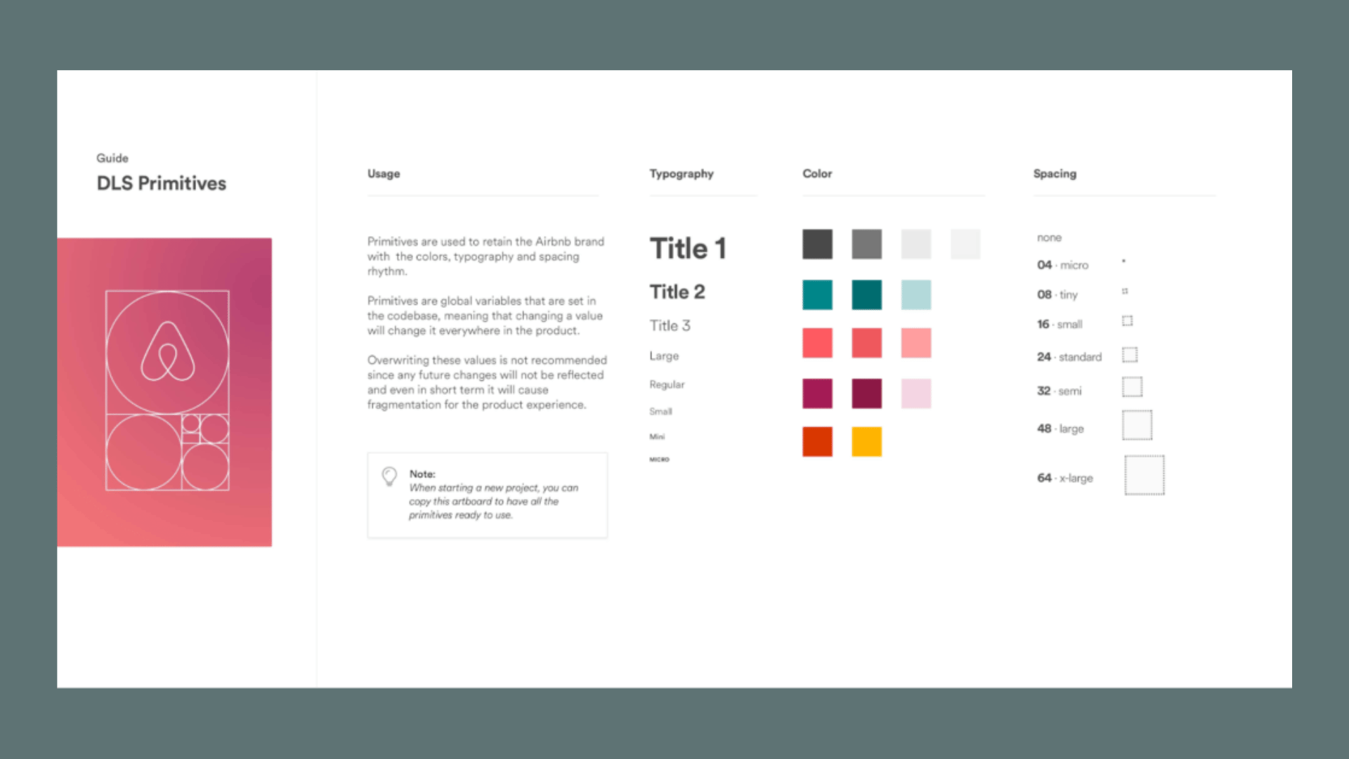
- Design-system readiness. Tokens, components, and Dev Mode exports mean developers implement the brand correctly the first time, not the fourth.
- Real in-use examples. Seeing the logo on a billboard, an app screen, and a shipping box teaches more than a paragraph of rules ever will.
- Governance you can trace. Versioning, owner roles, and a visible changelog stop three teams from quietly running three different logo files.
Shopify’s analysis of brand portals notes that top brands now combine asset repositories, verbal tone guidance, UI kits, and code snippets in one place specifically so teams can maintain consistency at scale, not just at launch. That combination, assets plus rules plus code, is the real dividing line between a guideline that gets used and one that gets filed away.
Pro Tip: Before you study any example on this list, write down the three mistakes your own team makes most often, wrong logo color, stretched wordmark, off-brand font substitution. Then read every example hunting specifically for how that brand solved those three problems.
12 Brand Guidelines Examples Worth Studying
These twelve span streaming, finance, hardware, and retail, and each one earns its spot for a specific reason, not just brand recognition. Some are full design-system portals; a couple are older-style PDFs that still get cited because the fundamentals are so clean. Read them for what to copy, not who published them.

1. Netflix Brand Assets
Netflix runs one of the cleanest asset portals in the industry: logo files in every format, clear usage rules, and strict do-not rules around recoloring or distorting the “N” mark. The takeaway to steal: Netflix separates its consumer-facing brand assets from its internal design system, which keeps the public portal lightweight while the product team works from a denser, token-based library internally. If you serve two audiences, external partners and internal designers, consider splitting your documentation the same way.

2. IBM Design Language
IBM’s design language site is closer to a design-system textbook than a brand book, and that is exactly why it belongs here. It documents color, type, iconography, and motion as interconnected systems rather than isolated rules, and it explains the reasoning behind each choice instead of just stating it. The takeaway: IBM shows its work. When a rule includes a short “why,” teams follow it more willingly than when it arrives as an unexplained mandate.
3. Dropbox Brand Guidelines
Dropbox built its identity around a distinct illustration style and a confident, almost playful voice, and its guidelines spend real space on tone of voice examples, not just visual rules. Sentence-level writing samples show the difference between “on-brand” and “off-brand” copy side by side. The takeaway: if your brand has a verbal identity worth protecting, show contrasting copy examples. A rule like “be conversational, not corporate” means nothing without a before-and-after.

4. Spotify Design Guidelines
Spotify’s guidelines lean hard into music-driven visual language, duotone photography treatments, bold color blocking, and a wordmark with exacting proportion rules. What makes it worth studying is the sheer volume of in-use examples: playlist covers, app screens, out-of-home ads, all shown together so a designer can see the system flex across formats without breaking. The takeaway: show the same logo lockup across five different contexts, not just one hero shot.
5. Apple Design Resources
Apple keeps its public developer-facing guidelines notably restrained: precise typography specs, exact icon grid systems, and strict rules on how the wordmark can and cannot appear next to third-party marks. There is very little narrative fluff. The takeaway: precision beats persuasion. Apple’s guidelines read like engineering specs because that is what a scaled brand system actually needs at the implementation layer.

6. Mastercard Brand Center
Mastercard’s brand center is a strong example of governance done visibly. It documents not just the interlocking circles mark but exact rules for co-branding with banks and partners, a scenario most brand books ignore entirely. The takeaway: if your brand regularly appears alongside partner logos, cobranding rules deserve their own dedicated section, with sizing ratios and placement diagrams, not a vague footnote.
7. Starbucks Creative Expression
Starbucks’ guidelines emphasize photography direction and packaging application almost as much as the logo itself, reflecting how much of the brand experience happens through product touchpoints rather than a wordmark alone. The takeaway: audit where your brand actually shows up. If most customer contact happens through packaging or in-store signage rather than a website header, your guideline needs to weight those sections accordingly.
8. Instagram Brand Resources
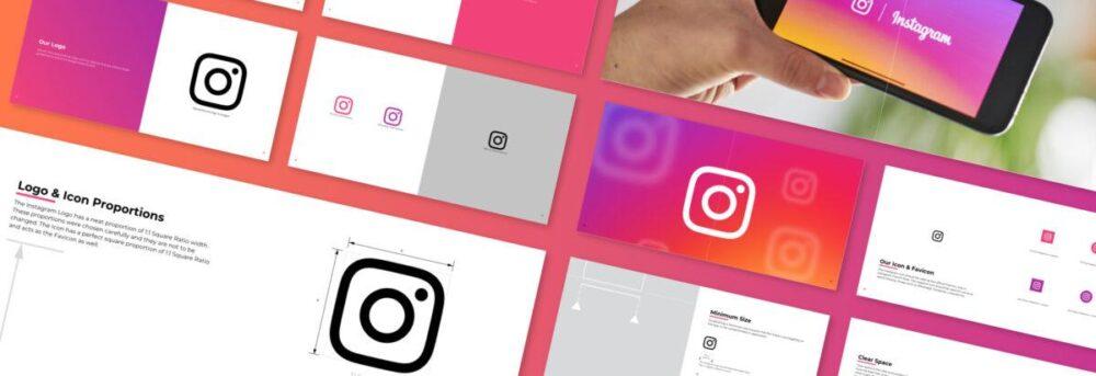
Instagram’s public brand guidelines are narrow by design, mostly covering how third parties can reference the Instagram name and logo in their own marketing. That narrowness is the lesson: not every guideline needs to cover everything. A tightly scoped external-use document, separate from the internal design system, prevents partners from misusing assets while keeping the internal team’s working files private.
9. A Fintech-Style Token Library Approach
Rather than name a single company here, look at how modern fintech and SaaS brands increasingly publish design tokens as the actual source of truth, color, spacing, and typography defined once in code and referenced everywhere. The takeaway: a token library eliminates the “which blue is correct” argument permanently, because the answer lives in one file that both design and engineering pull from.
10. A Global Retail Packaging System
Large retail and CPG brands with guidelines built around packaging tend to include exact die-line templates, Pantone-to-CMYK-to-RGB conversion charts, and print-specific do’s and don’ts that digital-only brands skip entirely. The takeaway: if physical products are part of your brand, your guideline needs a print section with the same rigor as your digital one, not an afterthought paragraph.
11. An Enterprise SaaS Component Library
Enterprise software brands increasingly ship their brand guidelines directly inside a component library, where a button’s color, radius, and hover state are documented as a living component rather than a static image. Figma’s guidance on design systems treats this as the standard: one source of truth for styles and components, with clear naming and version control. The takeaway: if your product team already maintains a component library, your brand guideline should link directly into it instead of duplicating specs.
12. A Community-Built Starter Template
Not every brand starts with a Netflix-sized budget. Figma Community hosts free brand guideline templates that smaller teams can duplicate and adapt in an afternoon. The takeaway: a rough, well-organized starting template beats a polished guideline you never finish building. Ship something usable, then refine it.
How to Turn These Examples Into Your Own Guideline
Studying twelve strong examples is the easy part. Converting that inspiration into a document your team actually opens is where most projects stall. The path that works is short: audit, prioritize, tokenize, publish, govern.
- Audit what you already have. Pull every logo file, color reference, font license, and old deck currently floating around your company. Most teams find three or four conflicting logo versions in this step alone.
- Choose the essential sections first. Logo usage and clear space, color palette, typography, tone of voice, and in-use examples cover 80% of daily design decisions. Build these before touching anything aspirational like brand story or mission language.
- Build a minimal token set. Start with color, then spacing, then typography, in that order. Figma’s design tokens guidance recommends naming tokens by role rather than appearance, so
color/primarysurvives a rebrand butcolor/bluedoes not. - Create three in-use component examples. Show your logo on a real ad, a real app screen, and one more real context relevant to your business. Screenshots beat mockups because they prove the rule actually works in production.
- Add a do’s and don’ts matrix for each asset. One row per common mistake: don’t stretch the logo, don’t place it on low-contrast backgrounds, don’t recolor it outside the approved palette.
- Set governance before you publish. Assign an owner, decide who can request exceptions, and add a visible changelog so version two doesn’t silently override version one.
On naming conventions specifically: follow a category, role, variant structure. color/primary/default, text/heading/1, space/8 reads clearly to both a designer in Figma and an engineer reading code. Figma’s lesson on building design systems recommends aligning token names with engineering conventions like camelCase specifically so handoff doesn’t require a translation step every time.
Pro Tip: Don’t wait for the “perfect” full guideline before publishing anything. Ship a minimal living version, logo rules, three tokens, three examples, in one sprint, then layer in governance and additional sections over the following weeks. A guideline that exists and gets updated beats a comprehensive one still in draft six months later.
Here is a short content checklist you can copy directly into your own document:
- Logo variations, minimum size, and clear space rules
- Primary and secondary color tokens with accessibility contrast notes
- Typography scale with role-based names, not just font family names
- Voice and tone examples showing on-brand versus off-brand copy
- Three to five real in-use examples across different formats
- A do’s and don’ts matrix for the three most common misuse cases
- Owner name, version number, and last-updated date
Where to Find These Guidelines Published Live
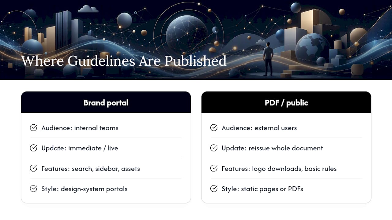
Most of the examples above live in one of two formats: a dedicated brand portal at a subdomain like brand.company.com, or a downloadable PDF hosted on a corporate press or design page. The portal format has become the clear preference among larger brands because it can be updated the moment a rule changes, while a PDF requires re-issuing an entire document.
Dropbox and Spotify both maintain standalone brand sites separate from their main marketing pages, structured almost like internal wikis with a search bar, sidebar navigation, and downloadable asset packs. Mastercard and IBM lean toward denser, design-system-style portals with component libraries baked directly into the same hub. Apple’s approach sits closer to developer documentation than a traditional brand book, hosted as static reference pages with exact technical specifications rather than persuasive brand language.
The practical lesson for anyone building their own: decide early whether your audience is mostly internal (a design and product team) or mostly external (press, partners, franchisees). Internal audiences benefit from a living portal tied into your design tool of choice. External audiences often just need a clean, scoped PDF or a simple public page with logo downloads and basic usage rules. Trying to serve both audiences with one document is usually where guidelines become bloated and hard to maintain.
What Strong Guidelines Actually Change in the Business
Brand guidelines rarely get credit for revenue, but the mechanism connecting the two is straightforward. Inconsistent execution, mismatched fonts on a landing page, a stretched logo in a partner deck, a tone-deaf social caption, forces customers to work harder to recognize and trust a brand. That friction shows up downstream in conversion rates, campaign turnaround time, and how quickly a new hire or agency partner can produce on-brand work without a dozen rounds of revisions.
Teams that treat guidelines as living systems with visible changelogs and versioning report fewer inconsistent creative outputs and faster campaign production, because nobody is guessing which logo file is current. That speed compounds. A marketing team that spends less time hunting for the right asset spends more time actually producing campaigns.
The clearest business case shows up in Shopify’s observation that a short, prescriptive do’s and don’ts matrix for each major asset prevents the most common misuse patterns before they happen, logo scaling errors, color substitutions, incorrect wordmark spacing. Preventing those errors upstream costs far less than fixing a printed catalog or a live ad campaign after the fact. A guideline that catches a mistake before it ships is worth more than one that only documents the mistake afterward.
How Brand Guidelines Have Changed Over the Past Decade
A decade ago, most brand guidelines shipped as a single 60 to 100 page PDF, heavy on mission statements and mood photography, light on anything a developer could actually implement. That format made sense when brands lived primarily in print and broadcast. It stopped making sense the moment brands started living primarily inside apps, dashboards, and component libraries.
The shift toward web-first portals tracks almost exactly with the rise of design systems as a discipline. Once product teams started building shared component libraries in tools like Figma, it became obvious that a static PDF couldn’t stay synchronized with a color palette that lived in code. Tokens solved that problem by making the guideline and the implementation reference the same underlying values.
The next visible shift is happening now: guidelines are increasingly documented alongside, or directly inside, the design tool itself rather than as a separate deliverable. A Figma file with linked styles, components, and annotations often functions as the guideline, with a lightweight public page layered on top for anyone outside the design team. That collapses the gap between “the rules” and “the actual working files” that used to require someone to manually keep two documents in sync.
Tailoring One Guideline for Every Platform
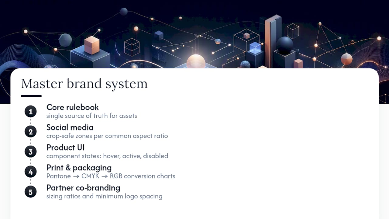
A single rulebook rarely fits print, digital, social, and product UI equally well, and pretending it does is how guidelines become vague enough to be useless everywhere. The fix isn’t twelve separate documents. It’s one core system with platform-specific application notes attached to each asset.
For social media, the priority is safe zones and cropping. A logo that looks perfect on a website header can get clipped badly in an Instagram Story or a LinkedIn banner, so guidelines need explicit crop-safe zones for each common aspect ratio.
For product UI, the priority shifts to components and states. A button isn’t just a color and a shape; it needs documented hover, active, and disabled states, which is exactly why mature brands push this documentation into a shared component library rather than a static brand PDF.
For print and packaging, color conversion matters more than anywhere else. A Pantone spot color, its CMYK equivalent, and its RGB equivalent can all render slightly differently, so packaging-heavy brands document conversion charts that digital-only brands never need.
For partner and co-branded materials, sizing ratios and minimum spacing between logos prevent the awkward “whose logo is bigger” conversation that Mastercard’s cobranding rules address directly.
The organizing principle: keep one master set of rules, then attach a short platform note to each asset explaining how the rule bends, not breaks, in that specific context.
Keeping a Brand Guideline Alive After Launch
A guideline that ships and never gets touched again starts decaying within months. Someone adds a new product color nobody documents. A new hire designs a flyer using the wrong font because the “updated” guideline they found was actually two versions old. Maintenance isn’t a nice-to-have step tacked onto the end of a brand project; it’s the difference between a guideline that stays useful and one that quietly becomes shelfware.
Assign a single owner, not a committee, responsible for approving changes and updates. Committees are where guideline updates go to die. Review the guideline on a fixed schedule, quarterly works well for most teams, rather than waiting for a crisis like a rebrand deadline to force a review. Keep a visible changelog so anyone can see what changed and when, the same way software teams track release notes. And whenever a new asset gets approved, whether it’s a new icon set or a new tagline, add it to the guideline the same week, not the same quarter. Guidelines decay fastest in the gap between “we decided this” and “we documented this.”
Why Living Brand Portals Win in Practice
The strongest argument for a web-first, token-backed guideline isn’t aesthetic. It’s operational. A PDF asks every team to remember to check for updates. A living portal, wired into color and type tokens, updates itself the moment someone changes a value in the source file, and every connected surface inherits it automatically.
Rapid MVP work punishes ambiguity. When a client needs a usable brand system in days rather than months, there’s no room for a 100-page manifesto nobody reads before the deadline. What ships instead is a minimal, working set: logo rules, three core tokens, a handful of in-use examples, published somewhere the whole team can actually reach it.
The payoff shows up downstream. Clients working from clear, token-based systems tend to see faster production cycles and fewer inconsistent executions, a pattern behind conversion improvements some agencies have measured across client engagements. A brand system that’s easy to use gets used correctly. That’s the whole game.
Get a Working Brand Guideline Without Starting From Zero
Building one of these systems from scratch takes real time, and most teams don’t have a spare quarter to spend auditing old logo files. There is a free branding checklist template available for download that can be adapted directly from the examples above, no agency call required to get moving.
If the checklist surfaces gaps bigger than a DIY fix, Raw’s branding services build the full system: logo architecture, color and type tokens, voice guidelines, and governance rules, delivered through the same design sprint model used for UI design and UX design engagements. Teams looking for a deeper strategic reset can start with Brand Elevation, which pairs the visual system with positioning work. A typical engagement aims to deliver a living, token-backed portal that teams can maintain, rather than a PDF that goes stale in six months. Start by downloading the checklist, then reach out for a scoped conversation about what your brand actually needs next.
Get a UX & CRO Expert’s Eyes on Your Website. Book a free 30-minute UX Teardown and get actionable insights on what’s costing you conversions — no fluff, just fixes you can implement right away.
Book a Free UX Audit

Related posts

Top 10 Creative Design Agencies in Australia in 2026
By 2026, creative design agencies in Australia have moved far beyond just making things look good. The top agencies now […]

Case Study: How Airbnb Increased Bookings by 25% with 3 Trust-Building UX Changes
When Airbnb launched in 2008, it was asking people to do something that felt fundamentally uncomfortable: sleep in a stranger’s […]

Why Multimodal UX Is Becoming the New Standard for Digital Products
Not long ago, “good UX” mostly meant getting buttons, screens, and flows right. Today, users interact with products while walking, […]
Creative product design that gets results
Take your company to the next level with world class user experience and interface design.
get a free strategy session
